Graphic Design
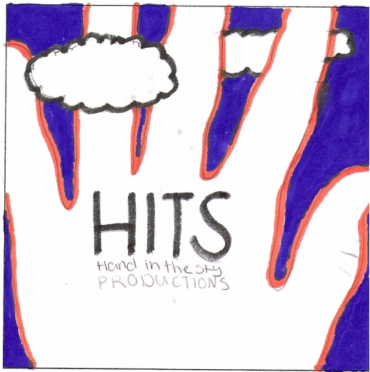
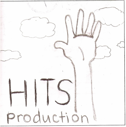
First Critique: Some of the suggestions I was given for the first critique were to make the hand bigger, consider keeping it in black & white and some people suggested that I add color. I also got kind comments on the "cartoony hands", texture in the clouds and the proportion of the hand to the clouds. I decided to add color and make the hand bigger as I felt those were the most helpful critiques
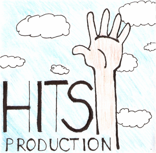
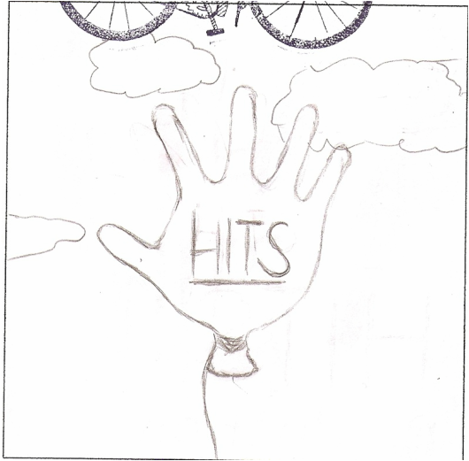
Second Critique: This critique I felt was most helpful. I got many critiques suggesting things as underline "production" to add emphasis and fill in the "O's" to add value. That made my font my own with a creative look that attracts attention.
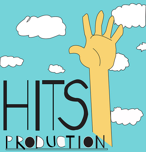
Final Logo: I am proud of the outcome of my final logo. I worked really hard and I feel it shows. I picked a bright strong blue that stands out compared to a light faded sky blue that doesn't draw as much attention to it. I tried to add emphasis to the "HITS" by making it large and bold as well as proportion of the hand to the clouds.
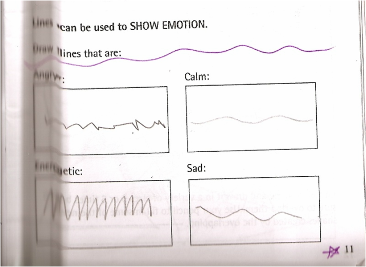
Line Element
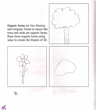
Natural Element
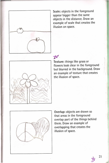
Space Element
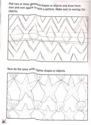
Pattern Principle
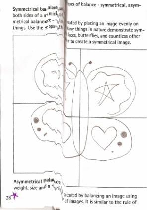
Balance Principle
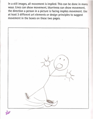
Movement Principle
Logo Design 1
Logo Design 2
Logo Design 3